Showing posts with label RPGs. Show all posts

Saturday 23 February 2013

The reprint of 'White Box' D&D rules...

Lately my brain has been involved with things other than RPGs (namely, creating illustrations for a book on the Paquisha War) but the recent news from WotC put the ol' grey matter back into gear.

Now, whilst I think it's great that WotC have started re-releasing the classic D&D stuff, it seems that with the White Box they've been nabbed by a trap that they keep wandering into. That is, they seem unable to not mess with things that aren't broken. More specifically, their decision to redo the cover art for the booklets seems to be another example of their weird need to mess about with things that don't need it. What was going through their minds? Why try to recreate the way D&D once looked but then think that bits of it need tweaking?  

The new artwork is okay in a sort of predictable way, but asking for 150 bucks for something that seems closely akin to a bad cover version of one your favourite songs is a bit iffy, in my opinion. I've never been a fan of WotC's overall approach to D&D, and this sort of stuff doesn't do them any favours in my mind. 

There's nothing wrong with the original artwork. Older versions of D&D have some measure of allure precisely because the artwork has it's own style. The styles and clichés that are more commonly associated with D&D and other fantasy RPGs were not yet entrenched. Even a website like Something Awful, which has done it's fair share of pointing out that bad stuff, still manages to note in a recent article that the old artwork has a certain odd charm. WotC seem to insist on ignoring this - or, even worse, think that supplanting the old artwork is somehow necessary. 

Calling something 'Premium' does not make it better, nor does it make it seem less like a way of making a quick buck by despoiling an icon of RPG history. If you're going to do a reprint, do a faithful one.


Friday 1 February 2013

Interstate '76...

Further to my previous post about Car Wars, one of my all-time favourite digital games is Interstate '76. It seems heavily influenced by Car Wars, albeit with a tongue-in-cheek nod at things such as 'The Dukes of Hazzard' and various straight-to-video films from the '70s and '80s. The intros and cut-scenes were always very amusing...


Failing that, it's always worth it for the great music...!

In Praise of... Car Wars

I've always been a big fan of Car Wars (CW). A schoolfriend had a copy and around 1982 or '83 a bunch of us played it on the big wooden table his parents had in their lounge. That said, we'd didn't play as much as I would've liked and I tended to end up having my vehicles trashed. If I remember correctly, my very first car - a Killer Kart - was pretty much vapourised by an anti-tank gun. My second, a trike, was chewed up by a Vulcan MG and my driver didn't survive the resulting high-speed Roll and Burn. Awhile back I started buying bits and bobs of CW stuff on Ebay...


One find was the book you can see in the top left, 'Fuel's Gold'. This is a Fighting Fantasy-style game book and I only recently became aware that such books existed for CW. This dates from 1986, has a Larry Elmore cover and some pretty nice interior artwork. I've played it through a few times and it's good fun, and certainly seems to make more sense than some of the Fighting Fantasy adventures I've put myself through in the past.

One thing I've always enjoyed about CW was the system itself. Initially it seems somewhat complex, with various different things to keep an eye on when playing, but once one gets the hang of it it's a lot of fun. The later versions feature aircraft and waterborne craft, which add some nice extra detail for other ways of autodueling. The huge amount of kit that you can install and use to customise your vehicle very much widens the scope of what can happen (and the various ways to to trash or get trashed) during combat. True, it is mostly a game about combat but the scenario packs (such as Truckstop) are good at adding some layers of depth to the 'why' of autoduelling. The GURPS Autoduelling supplement is another layer of interaction with the system and the setting. The overall vibe I've always had from the game is that it's not 100% serious - if anything, the way that world of CWs evolves from the potted history given in the rules is somewhat cynical in an amusing way. At least, that's my take on it.

CW and D&D are both games that had a big impact on me when I was first introduced to RPGs, especially so in the way that they inspired me to learn how to design my own game systems. Admittedly this was partly derived - at least as far as CW was concerned - from the fact that my poor grasp of maths and keeping numbers in my head made me wonder if I could make a simpler form of a CW-style game. This ran parallel to seeing rental videos of Mad Max I and II, Damnation Alley, Battletruck, etc. In fact, the first version of my vehicle combat game was called Mad Max...

I think this dates from sometime in 1983 - written in the back of a school exercise book.
And you can see that the CW influence was still quite distinct:


I enlisted my brother's help in fleshing out some of the rules, and the setting also changed as that happened because we wanted to have more RPG elements than was the case with CW. Our game was called 'Freeway', and a bunch of us playtested the system. At one point it was based in a post-apocalyptic future because the Earth had been attacked by aliens (the Slatzians), and so player-characters and vehicles were freedom fighters. That didn't last too long as a concept, because of 'Warlock' magazine. Issue #2 of Warlock featured a short story by Garth Nix called 'Sam, Cars and the Cuckoo' and at the time was published to set the scene for the upcoming 'Freeway Fighter' FF book.

"Hey, Sam, you've got a bird on your windscreen."
A bird? My God, I thought, what's that? A BIRD -- Blast Intensified Radioactive Device? A Bad Infra-Red Destroyer?
"I think it's a cuckoo."
Three things then happened. Firstly, we changed the name of our game from 'Freeway' to 'Motormania'. Secondly, our setting started to derive ideas from the Garth Nix story. Thirdly, the spot illustration above and the vehicle descriptions in the story suggested designs that were somewhat different from CW. They're more like modern armoured vehicles, albeit souped-up and stuffed to the gills with weapons, electronics, etc. But don't just take my word for it - read the original story.

From that point onwards I took the design under my wing and did a large amount of reworking. Various other RPGs (Star Frontiers, Twilight:2000) fed their influnces into it. Over the following years, the guys in my RPG group tested various different versions of 'Motormania' and in the end it amassed quite a bit of paperwork:

The 1994-era version. Each of the above pages has two sides. There are 26 pages and one character sheet. I think around 3 to 4 other pages are missing, presumed lost.
The story doesn't end there. I still want to go back and overhaul the system. Various bits of the it are missing and some abbreviations I used way back when have to be deciphered. Designing, redesigning and play-testing the game time after time taught me a great deal about what it takes to design a system and what you need to consider when designing a game. This stood me in very good stead when I later became involved with designing digital games.

But, strip away the layers and is still all based on a long-running interest in the quite mad fun that's inspired by autodueling and the possibilities that a great game like Car Wars suggests. There's a rumour that a new version with actual 3D counters may see life as a Kickstarter project from Steve Jackson Games...  

Friday 25 January 2013

A Ransom System for AD&D...

Inspired by my previous post on the subject of ransoms, what follows hereafter is a basic system of ransom for use in 1e AD&D. I've decided to go for 1e AD&D from the outset, so that things keep fairly simple for now. This is also a first draft, so somewhere along the line it may get rewritten, adjusted, etc.

Ransoms

Players may find themselves in a situation where they have captured someone of value to another person, society, place etc, and that this can be used for financial gain in some way. This doesn't always mean that the players are involved in a form of absolute extortion - they may be well justified in seeking ransom for some past wrong-doing. The idea of ransoming a person for money (or some other equivalent form) may appear abhorrent to some players and character types. For example, would a Paladin really indulge in such measures? Well, possibly. A ransom could be seen as a way of paying pennance or a method by which a grievance is settled. Ransom could be a system through which another party is being forced to pay for the misdeeds of the captive. Of course, the players may end up in a situation where they themselves are the captives, and so this system could also be used to measure their apparent worth.

Step One: Market Forces, basic values

The basic price on the head of any given character class could vary from place to place, depending on the apparent worth of that person's class. For example, the players may be adventuring in a place where more value is given to those persons engaging in magical practices. A town that is a haven for thieves may place greater value on one of their own kind than, say, a magic-user. That said, we can perhaps start from some simple premise of a baseline value (in gold pieces) for each character class at 1st level:

Cleric 20
Druid 20
Fighter 30
Paladin 40
Ranger 30
Magic-User 30
Illusionist 20
Thief 10
Assassin 10
Monk 15
Henchman 10
Hireling 10

Of course, 1st level characters will probably not be of much worth to someone else. Other factors will affect their value. Henchmen and hirelings are included on this list because they also have some basic value to other players, NPCs etc and therefore the following steps may also apply to them.

Step Two - Level multiplier

A level multiplier is then applied to the base number above.

Example: a 5th level Paladin is worth 200gp (5x40gp).

Step Three - Status multiplier

Status denotes the apparent value an individual has in terms of social standing, if relevant. This will of course vary from place to place, depending on how the person is viewed by others. If we take the idea of some form of community role or nobility as an example, we could apply these multipliers:

Local mayor x2

Minor nobility x3

Direct descendant of local king x5

Local king x10

Example: a 5th level Paladin who is the son of a local king is worth 1000gp (5x200gp).

The Dungeon Master would have to exercise some reasoning here with regard to henchmen and hirelings - for example, an expert blacksmith in a city that has other blacksmiths may not have a much status as one who is the only blacksmith for miles around. Out in the wilds, a whole area may rely on his or her skills. Thus, the city expert is akin to a x2 ('local mayor'), whereas the rare and valuable blacksmith is x5 or possibly even x10.

Step Four - Fame multiplier

Fame is another form of social standing that may also supercede that individual's social status. What drives that in terms of overall value is how well the fame is known over a distance. A village hero of great worth to his local people could be unheard of in a town 50 miles away. The following multipliers could apply:

x2 (the person is known to the local population)

x3 (the person is known to the local area)

x5 (the person known to a kingdom)

x20 (the person known to whole land)

A local area, land, or kingdom may be relatively small - what matters is how many other people know the the person's fame and how important it is to them a whole. Even the ruler of one kingdom may be of little value to another, depending on their perceived worth. A leader of an army of thieves might be famous across a whole land within which lie several kingdoms.

Example: a 10th level Thief king who is known throughout a whole land is worth 20000gp - 10gp x 10th lvl =100gp, x10 (local king) = 1000gp, x20 (known to a whole land).

Non-Human Followers

It's possible that certain high level players have non-human followers, and that those followers may also have some level of status and/or fame. If so, take the non-human's hit dice, multiply it by the gp value below, and then apply Steps Three and Four if required:

Centaur 200
Hippogriff 200
Pegasus 300
Brownie 100
Pixie 100
Pseudo-dragon 350
Satyr 300
Sprite 200
Copper Dragon 500
Storm Giant 1000
Treant 300
Werebear 100
Weretiger 100

This reflects that apparent worth due to their various abilities, magic, and other powers - not to mention the fact that they may also potentially be harder to take as captives.

Like I said, this is a first stab at some form of system. It is somewhat more fluid than the Medieval system which inspired it, as the world of D&D is not so entrenched in terms of heirarchies, social mores and social values. This system should be fluid enough to deal with most circumstances, but please feel free to try it and provide some feedback and critiques!

Thursday 24 January 2013

Medieval warfare had a well-organised 'ransom market'

The capture of the French king John II at Poitiers in 1356 (Source: Wikipedia)
 
This interesting article appeared today on the BBC website. It seems that there was a system involved which governed what happened to prisoners of war in the Medieval period, and that it could be a lucrative source of income for those doing the capturing. Also of note is the fact that a captive could be taken back to their home in order for the ransom to be paid.

Treasure is always an good incentive for play in fantasy RPGs, and the idea behind this system shows that it could be possibly adapted as a set of rules. Aspiring adventurers could always develop it as an interesting sideline to their adventures and campaigns.

Tuesday 22 January 2013

Demonagerie - the strange world of Medieval art

Fantasy RPGs can tend to draw on the Medieval period for influences, but at the same time miss out slightly on the sheer oddity of that period's worldview. Even Ars Magica seems to have skimmed past this, which is a shame. Instead, for the most part, we tend to get presented with the Conan-style fantasy angle which to my mind has never been a particularly good influence. Why? Well, I've never been completely sure that it's not been conflated with the horror that is the Renaissance Festival...


Is this because of a somewhat peculiar take on the Medieval period, combined with a vibe that owes more to Hollywood films than it does to an understanding of European history and culture? Hmm. Possibly.

However, should one want to tap into the actual period one would discover that it is full of odd imagery that wouldn't look too out of place in, say, a D&D setting. For example:


This picture comes from an excellent site called Demonagerie, over at Tumblr. There's lots of demons, dragons, monsters, knights and a variety of other images and symbolism that may help to inform or flesh out your fantasy campaign. Huzzah!

Saturday 5 January 2013

Something for your Paladin...


Over at the excellent Bibliofind blog you can see various interesting examples of heraldry from the Medieval period. These range from the quite simple (i.e. in the image above) to the more ornate. They could perhaps be a source of inspiration for your group's Paladin, or those of various other knightly persuasions. Bibliofind has also collected other examples - check the links at the end of the blog post.

Thursday 20 December 2012

Happy crossbows... I mean, Christmas...!

Before I sign off the the holiday and disappear into the wilds of Somerset, I thought I'd point you at this interesting clip on Youtube:


I gather that this demonstrates the use of what could be called an Arbalest, as this seems to be what we can see in the footage. These would be what D&D would call a 'heavy crossbow', and seems to be a bit more dangerous than the D&D version. That said, there are accounts of brigandine being able to provide protection against crossbows - although what type of crossbow and at what range, I'm not sure.

See you in the New Year - providing I haven't suffered death by cider...

Wednesday 19 December 2012

Taking breastplates too literally...


As I've said before, the way women are depicted in many fantasy RPGs is usually pretty poor. I was going to consider how this tends to revolve around the artists apparently being obsessed with showing cleavage no matter what, and that the depiction of women in armour was not immune from this. This was then going to segway into the impracticality of such designs - but someone has beaten me to it.

As that article points out, the type of armour shown in the above photo would cause problems to the wearer should she fall forwards. Even with a padded jack underneath, the amount of damage caused by blunt trauma wouldn't be at all pleasant. You also don't really want to have anything that acts as a handy channel for weapon strikes against vital organs. Traps and channels on armour, shield bosses and weapons are there to snag or interfere with the path of an attack in some way. Ideally that means that the attack is kept away from the vitals, limbs, etc. A similar principle occurs with another armoured thing - tanks. Certain parts of a tank can, if not designed correctly, act as 'shell traps' for incoming rounds. Sometimes this traps those rounds near vital areas, such as the drivers position. Not good.

The article makes note of female armour in Mass Effect 2, but I'd say that that's also barking up the wrong tree. First and foremost, it's pointlessly sexualised in a way that the man's armour is not. If the same thing was done with the man's armour - say, the inclusion of a large, protruding armoured codpiece - most people would say 'That looks ridiculous'. But for some reason this sort of silliness generally isn't pointed out when women's armour is sexualised. Secondly, it's not at all practical for someone who may need to lie prone when firing a weapon, take cover, crawl, etc (and the same rule would apply to the armoured codpiece). Take an illustration from modern body armour - here, for example. Note that there's no mention of women needing an armour that both seperates and supports. It just needs changing in a few key areas to better match the anatomical differences. The same factors would apply to women wearing armour in a fantasy RPG setting. 

What does this mean for an artist wishing to avoid the common cliches? Well, the simple fact of the matter is that there's pretty much little difference in the way that men and women look whilst wearing armour. This is especially so with plate armour, and if a full-face helmet is worn. However, that doesn't mean that there aren't subtle visual cues. If we consider the fact that, even in a fantasy RPG setting, men and women fighters would have had to have trained with their armour since an early age we could perhaps take our cues from modern imagery. One possible consideration could be male and female athletes from the same sports. There are similarities in their body shapes to a certain extent (depending on the sport), but there are also differences. At the end of the day this boils down to a couple of factors. One: an understanding of anatomy (hint: breasts aren't solid masses). Two: observation of how things can look in real life and drawing on that for inspiration. Three: developing an understanding of what's being observed (for example, how is the armour constructed? Is it part of a layered suit?). Whilst I might hesitate to say that many RPG artists lack such skills, it does seem that they are willfully abandoning them in order to follow a more hackneyed approach. That doesn't ultimately send out the right sort of signals, both about the outlook of the artist nor whatever RPG is using the artwork.

One other factor that seems to feed into this is the way women are portrayed in other fantasy art. I'd say the main culprit is comic art, of the super hero variety. Super heroines tend to wear 'boob socks', and it seems that the fashion has been translated into armour somewhere along the way. Maybe with a nod towards being slightly less silly, but silly nontheless.

But it's not all doom and gloom. We don't have to be stuck with chainmail bikinis and those breastcup cuirasses. There are depictions out there of women in armour that aren't rubbish. For example...

The above image is of Theresa Wendland, and comes from here
A nice example from LARPing...

Sourced from here
Some lamellar armour...

Sourced from here

Some more plate, this time worn by Virginia Hankins...

Sourced from here

And if you want something with more of an RPG flavour, there's this...

Sourced from here

And here's a more naturalistic pose (okay, it's not armour but there is a weapon involved)...

I wish I knew where this originally came from. I dug it out from Tumblr somewhere and haven't been able to find it via Tin Eye...

See? All pretty good! And not a chainmail bikini in sight. Okay, so perhaps some of the above are a little stylised. What if we consider how a woman might look when engaged in combat with a sword or other weapon? Here's one interesting video, featuring Theresa Wendland:


Their training weapons are a bit heavier than actual fighting versions, but you get the idea. Note the stances, attacks and parries used in the above clip - all apparently sourced from actual fighting treatises from the Medieval period. And a tad different from the sort of fighting stances one sees women posed into for RPGs. Here's something a little more florid, although equally of interest and featuring Virginia Hankins:

Hopefully all of the above demonstrates that we don't have to keep treading the well-worn Dreaded Path of Ye Olde Fantasy Clichés. Artists can chose not to go down it, and hopefully one day more of them will. Women don't have to be dressed up in silly 'armour' and costumes for RPG settings. It just takes a bit of time and effort, and less of a closeted mindview as to how women are depicted.

Friday 14 December 2012

On the Physiology of... the Otyugh - Part Six.

Moving around

As I've previously mused on whether the Otyugh is more like some sort of slug, a question arises as to how it moves around. Originally I imagined that it had a slug or snail-like 'foot' - a sort of large pad which skimmed along a film of mucus. However, I wasn't sure that this was veering away too slightly from the whole idea of it being an animal which is fairly tough all over.

As it's a creature that needs to burrow into its food in some way, one idea was to make its underside flat but ridged so that it has some grip. That dovetailed into my previous ideas about the Otyugh being a mixture of rubbery hide and harder, mineral-like features. All of this combined into this scribble:

This shows a cross-section of one area of the body.

This shows those ridges, but also the teeth-like 'nails' it relies on for grip and perhaps also extra burrowing power. If we zoom in a bit, we can see how this might look in greater detail:


One idea driving this is that the underside is like some sort of toothed conveyor belt. With that in mind, a question arises as to how it might look when moving - I guess it could either move solely by the underside rippling along, or instead perhaps the whole body arches and rolls along in a caterpillar-like way. Here's a scribble showing how the muscles controlling this under the hide could look:

The idea is that they're ropey tendons attached to the main mass of the spine plates.

My various posts on the Otyugh will hopefully combine soon into a more detailed picture. Watch this space!

Monday 3 December 2012

Hellfrost Land of Fire Kickstarter

This Triple Ace Games' Kickstarter project finishes soon. They're pretty close to hitting their target funding level, so go take a look and see if it's your cup of tea:

More info...

Tuesday 27 November 2012

Pole axes, falchions, and other stuff...

When I first started playing D&D, I had no idea what a Bec de Corbin was, nor something as exotic sounding as a Bohemian Ear Spoon. The name alone was enough to conjure all sorts of mental images. Although recent versions of D&D seem to forgo the roots of the game with regard to the medieval influences, some of you may still want to include the variety of weapons 1e etc included. 

Luckily, there are various ways of finding out what those weapons looked like and what they did. You could, for example, get your hands on a copy of G.C. Stone's A Glossary of the Construction, Decoration and Use of Arms and Armor in All Countries and in All Times, Together With Some Closely Related Subjects. I advise getting a used copy, as they're cheaper (mine was less than 20 quid and seems to be an ex-library copy from Canada). It's a weighty illustrated tome that describes a variety of weapons that could be used in D&D or a similar fantasy setting. You just have to try and ignore the fact that it was written quite some time ago and still lists some cultures as being 'savages'. I kid you not.

If, however, you want a quick overview you could always try YouTube. For starters, there's this:


Or this:


Okay, the presenter is a bit creepy but neverthless it's interesting to see a reconstruction of these items and, to a certain extent, how they were used. 

If you don't mind the somewhat flippant approach to the subject matter, there's this:


Parts 2 and 3 can be found here and here. This gives a good basic overview of the sort of weapons one could use in earlier versions of D&D.

One interesting factor about some of these weapons is that they have more than one use. The pole axe has, for example, three different parts that can attack in different ways and these could be handy for different situations. This is isn't really covered by the 1e D&D weapon rules aside from what happens when being charged by an opponent. I guess that one could, as is the case with some monster attacks, divide up the potential damage into different types.

From an artistic point of view, such footage can come in handy when trying to visualise how someone might look when putting such weapons to use. There's also the fact that most of the people involved in these videos are wearing armour etc similar to the sort of kit adventurers would in a fantasy RPG setting (although perhaps not all that plate...). It seems that quite a bit of fantasy art owes more to LARPing or Renaissance festivals - which isn't a good thing.

Anyway, hopefully the above stuff shows that you don't have to resort to silly giant two-headed axes, massive manga-esque swords etc in order to have some interesting weapons to hand in D&D and other similar RPGs. As I've said before, history has usually already provided a tried and tested precedent that you can borrow from - and a fair few of these are somewhat exotic.

Right, I'm off to the shops. Now, where did I put that Earspoon...?

Friday 23 November 2012

Japan's ninjas heading for extinction

An interesting article appeared today on the BBC website about the demise of the ninja. It seems that once the last generation of actual ninjas dies there will be no more of them. I hope that there is going to be some sort of effort to set down information about what they did for the historical record.

I also imagine that, once this last generation has gone, the way ninjas are portrayed will probably get even sillier than has been the case over the years. As a subject, they've had a rough handling from film and TV - not to mention RPGs. Even basic ideas about what they look like have been disposed of, for various reasons. For example, this is what a ninja actually looks like:


And this is an example of how a modern RPG tries to do things:

The above image comes from a Gaming As Women article.
Note the difference between reality and a badly researched image. Poor ninja. And in the above case, poor female ninja. I also imagine you could hear her approaching a miles off with all that kit clunking about.

Why is this a big deal? Well, even in a fantasy setting, what enriches any given subject is how much it can tap into what's already real. I mean, what's the point of doing anything about ninjas if it's not taking a lot of cues from the real ones? Add to that the fact that, if you're going to borrow ideas from the history of any given culture, are you doing yourself any favours by trying to rewrite that for your own ends? Too many people have done a bad job of it - do you really want to add to that? If you're going to borrow, do a good job of it. Likely as not, the realities of how your chosen subject matter has developed during it's existence is going to a rich source of ideas and inspirations. Chucking all of that out of the window to make some half-assed presumptions is probably not a good idea.

If you don't believe me, see how bad things can get: MST3K goes toe-to-toe with 'Master Ninja'...


Tuesday 20 November 2012

All hail Escher Girls...!


On a day when some silly people couldn't decide whether they're still scared of women or not, I thought I'd draw attention to the excellent Escher Girls blog

Although it focuses more on artwork from comics, anime and digital RPGs, those providing artwork for paper 'n' dice RPGs should take note. As I pointed out in one of my previous blog posts, the depiction of women in RPGs is usually awful. Escher Girls does a great job of showing the same sort of silliness going on in other types fantasy artwork. For me, this works well on several levels:

- It shows that there seems to be little interest in actually depicting women in any sort of realistic manner, either thematically or physically.

- It shows how bad a lot of artwork is. Many artists either have no idea how to actually draw, and/or ignore anatomy in order to create some very weird poses. These are also sexualised, for some reason or other. Okay they can't draw men either, but they don't seem to try and make them fit into such poses. I suspect that what's actually going on is that artists are copying other artists, rather than learning how to to draw. This may explain why modern comics seem to be distorting things even more than older comics. Or, it may be that 'how to' guides by established artists also have  a poor attitude towards the subject.

- It's thought-provokingly funny. By deconstructing the various images, it shows how badly done most of them are and at the same time makes it very clear how far such imagery goes in it's crassness. This works especially well when the the characters are changed to being men. It's also interesting to see how changes can be made in order to make the images actually work.

Mixed in with all of this are a variety of posts which consider what's going on in the imagery and what it suggests about the various attitudes and assumptions involved. As with the Gaming As Women blog, it does a very good job at holding these things up for consideration. 

The world of RPG art is still pretty much making the same mistakes as many comics, anime, etc. It's obviously not because it's trying to treat the subject matter with any sort of balanced consideration. Or maybe it's just laziness. Either way, it should be easy enough to fix if enough time and consideration is given to the subject. It would also help on a technical level. Artists should be familiar with anatomy. They should have been to life drawing classes - or should plan on going to some. Don't simply copy what others have drawn. If instead you can only copy from photos, find some good ones. Even somewhere such as Flickr has enough stuff to pick from that doesn't rely on clichés.

Monday 19 November 2012

Turn to 400 - The Fighting Fantasy documentary film

As it's just passed the halfway mark, I thought I'd take the opportunity to plug  this Kickstarter project again:


If, like me, you grew up with the FF books and would like to see this worthwhile project come to fruition, please chuck some money at them! More info can be found at the project's Kickstarter page...

Wednesday 14 November 2012

Can RPGs be too clichéd (or worse)...?

A pet peeve...

One thing that's always bugged me about RPGs - especially those with a fantasy setting - is that they can tend to be chock full o' clichés. Not so much in how they read as a system or a world as such, but how they present themselves to potential players (and everybody else, for that matter). I noticed this as a new player back in the 80s, and it still seems to be a thorn in my side today. It doesn't seem to be as much of a 'problem' for, say, sci-fi or horror RPGs. Okay, this may be more about artwork than anything else, but art can sometimes be it's own strong theme within any given RPG. We can't deny that it's used in RPGs as a way to help frame the overall vibe of the game - but it seems that some clichés just won't go away. So let's consider a few of them...

Women

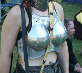
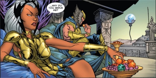
Let's face it, women are usually portrayed pretty bloody poorly in a lot of fantasy RPG art. This isn't just the case in '70s era D&D, where the social mores of the time were a little... different (not that that excuses it). It's still the case nowadays. WotC and Paizo are both guilty of this with D&D and Pathfinder. Much as they may try and wriggle out of it (i.e. see this interesting post over at the excellent Gaming As Women blog), they still tend to churn out the same old crap. Or variations on it. It's not exactly original nor is it something that sends out any sort of positive signals. Do I blame the artists? Well, yes and no. Maybe they just like to draw scantily-clad women. Or maybe their art directors say they should draw them that way. Either way, it's lazy.

The interesting thing is that the game world of D&D etc doesn't really mention anything about the role that women have in them. Okay, maybe these can be inferred in some way, but that's perhaps down to who's playing the game. Things seem to be inherently less polarised than real-world modern societies. But the way RPG art handles things tends to ignore this and instead plumps for tried and tested fantasy portrayals. To my mind this actually makes things less interesting. It seems that such portrayals have missed the plot.

Equipment

What do I mean by equipment? Well, I mean clothing, weapons, armour and general kit. There seems to be a tendency in modern versions of fantasy RPGs - and, again, D&D and Pathfinder being obvious examples - to seem to want to go down the World of Warcraft/Japanese digital RPGs route. That is, equipment is portrayed in a rather silly way, and some bits tend to get ignored completely. So the overall picture of any given character type focuses on certain things at the expense of others.

Let's take armour and weapons, for instance. Originally, D&D took it's influences for such things from the Medieval period, and with good reason. The way armour and weapons evolved up to and throughout that period fits the setting well, whilst at the same time suggests a plethora of styles and designs. However, this tends to get ignored. Your average depiction of a fighter-class person tends to owe more influences to Frank Frazetta than anything else. Or, as I mentioned above, World of Warcraft in mordern versions of some fantasy RPGs. Thus we see depictions of madly impractical armour and weapons - huge swords and double-headed axes, armour that you can probably only stand up in because of the spikes, huge curved sections, etc. Again, who's to blame? Well, I'd say artists. It seems that people haven't done some actual - even basic - research. Perhaps all that actual history just isn't enough. This is a real shame because if they stopped looking at how other lazy artists have done the same thing (a copy of a copy of a copy...), they'd see that armour and weapons from history can be interestingly eccentric. To give one example: many moons ago I created some artwork for the 'Ultima Thule' sourcebook for Ars Magica. I dug into my research and looked at how Viking and Scandinavian clothing, weapons, etc should look. This fed directly into my illustrations. All of that was then undone by the cover artwork, which decided instead to resort to clichés. The Viking even has a horned helmet. Oh well. Anyway - have a look at this page on medieval weapons and armour. Lots of odd designs there, but all evolved to be that way from practical use. This doesn't have to mean that it's boring. Similarly, if we have a look at the historical artwork of an artist like Angus McBride we can see that there's a variety of interesting shapes, designs and colours.

As for other bits of kit, things tend to get worse. Practicality is out the window. If a woman is wearing anything, it tends to be scanty in some way. If it's a magic user or magical character class, they wear some sort of elaborate cassock - unless they're a female magic user, in which case they wear something scanty but long-flowing (i.e. see the Pathfinder core rulebook cover). You rarely see 'in-action' scenes with the characters lugging about the stuff we all know they should have: rope, baggage, lighting, bedding rolls, etc. No-one seems to be wearing anything that would help you in a cold, dirty, inhospitable dungeon environment. Why can't someone depict a magic user in a more practical garb? A cassock-like thing doesn't seem all that sensible to me. Imagine the draughts, for starters.

To sum up (for now)...

Okay, this may seem like a bit of a rant. Perhaps I'm taking things too literally. But why should the depictions in fantasy RPGs be doomed to stick to clichés? It seems a bit half-arsed. Things don't seem to have changed all that much since the '80s. It's all a little too staid and predictable. Whilst I'm not saying that fantasy RPGs have to take their influences from medieval stuff, it might actually help drive things along more original paths. Failing that, is it perhaps too much to ask that something more imaginative gets added to the mix?

That's it for now - until I can write about some other stuff along similar lines. Please feel free to pick holes, disagree, etc...

Monday 5 November 2012

On the Physiology of... the Otyugh - Part Four.

Eyes

As the Otyugh is a weird creature, with a pair of eyes on a stalk and an aversion to light, one idea that came to mind was whether those eyes are actually anything normal. By 'normal', I mean whether they would be like an animal eye, with a similar lens, retina, etc. My line of thinking was continuing along with the idea that bits of the Otyugh are 'solid' in some way. A few themes could follow this; namely, whether the eyes are compound and also if they might be formed from blobs or clusters.

As you can see from my previous scribbles, I've suggested that there are blobby bits at the end of the eye stalk. If we zoom in on just this area, one concept was that the eyes are within the stalk and are made up up of several smaller solid sections:


You can see the aforementioned blobs, with nerve strands leading away down the stalk. Zoom in a tad more, and things start to look like this:


The picture above shows how the blobs are clustered within the left and right sides of the stalk, and I've included a side view of one blob. When I say 'blob', the idea was really more along the lines of them being solid in some way, and sensitive to light - but perhaps too much, hence their photophobia. One visual that fed into this design was the way things look when you slice a gooseberry in half:

Note the veiny bits leading to the seeds

Why a gooseberry? I dunno. Perhaps it's the way transluscent and solid mixes together. As I've said before, this mixing is how I imagine the Otyugh's overall look.

Anyway, another approach might be that the solid parts of the eye rest on the surface of the stalk. One interesting creature that uses minerals as the basis for a kind of eye is the chiton. Perhaps the Otyugh could have something similar, at least in the sense of those blobs being more like encrusted, light-sensitive primitive eyes formed from some sort of solid matter:


The scribble above maybe has things looking a little too conventional, but with the fourth drawing I was also thinking about the ways those solid bits might work as a single cluster.

This last scribble mixes the above concepts together:


The idea with this is to have a rough faceted look, either like coal or roughly worked flint. I've drawn an individual blob just to give some impression of the idea I'm trying to get across.

Still, I've not settled on a final look - although I tend to gravitate towards the look and feel of the last scribble. I also like the idea of the being able to see the nerve strands within the eye stalk. Maybe perhaps if the tip of the stalk was a little more opaque and was pigmented with various disgusting hues, it would help with camouflage when the Otyugh is hidden away...

Saturday 3 November 2012

Turn to 400 - The Fighting Fantasy documentary film

I thought I'd take the opportunity to plug  this Kickstarter project:


If, like me, you grew up with the FF books and would like to see this worthwhile project come to fruition, please chuck some money at them! More info can be found at the project's Kickstarter page...

Friday 2 November 2012

On the Physiology of... the Otyugh - Part Three.

Tentacles...

Here's a pencil scribble in which I try to out flesh out the overall shape of the Otyugh a bit more:


This is starting to move along the lines of how I envisage it might look, although the design is still evolving. 

As the Otyugh is described as having a pair of ridged tentacles, one is issue with this might be about how it can move along as it eats it's way through dungeon crap. When on the surface, this may not be a problem, but I was wondering whether they might sometimes actually be more of a hinderance than a help. One option might be that it drags its tentacles along with it as it moves, like this:


That might not always be practical. One thing that occured to me was the fact that the ends of the tentacles, being sharp, may be more like some sort of chopping/digging/cutting tool, as well as being weapons. The reason this popped into my head was from prior experience of... er... crap. Many moons ago (when I was 16, in fact) I got a part-time job helping to do maintenance work on a small-holding (a type of small farm). One of my main tasks was to herd goats from their covered pen each morning to a nearby field - I also had to herd the bloody things back again at the end of my shift. Another task was to clean out the pen. This wasn't a simple case of just chucking down some straw, oh no. My employers asked me to clear out all of the accumulated crap that had been there for years. This meant I had to chop down through a 2-foot deep layer to the concrete floor beneath. This was no easy task. Compacted years-old goat crap is very resilient, I'll have you know. I had to use various implements (fork, spade, hoe and shovel) just to make any sort of dent in the upper crust. Not all that much fun, as you can probably imagine. Don't try to imagine the smell as I broke through the surface either. This was all done at the handsome rate of £1.25 an hour for my troubles. I must've been bloody mad.

Anyway, the long and the short of it is that the Otyugh may possibly have to contend with similar trials when chowing down on dungeon crap, especially if it found a compacted layer in some dark corner somewhere. Perhaps it would need to chop its way through, thus leading to it evolving sharp edges to its tentacles - a handy adaption, as it also helps with defending itself. This might also mean that it would need to retract its tentacles when chopping and eating its way along:

Hmm - but maybe this makes it a little too seal-like...

With that in mind, I had a go at scribbling a few different ideas for how those sharper bits might look.

There's the spiny, curved profile theme:


Or variations on the 'chopping' theme:


I've yet to make up my mind which way the final design might feature these appendages.

Next up for consideration: the eyes...